
I recently had a freelance job designing labels for Forgotten Boardwalk Brewing Company of Cherry Hill, New Jersey. When they opened in 2014, I soon became a Thursday regular, getting to know owners Jamie Queli and Seth Dolled, and bartenders Ryan, Kai, and Marysia - who challenged me to spell her name (It took months to figure out). They were always so kind and welcoming, often topping-off my drink. They eventually had me drawing Minions on their large chalkboard menu behind the bar. By 2016 they were talking mural, but I moved back to California instead and that was that.
During the summer of 2022, Forgotten Boardwalk did an Instagram call-out, looking for artists to create labels for upcoming brews. I messaged them. They remembered me. Boom - I'm a label designer. Over the next 16 months, I would create 12 such designs that I share with you here, lucky reader.
1. Tightrope Walker

Jamie would send a pdf document providing the beer's name and other pertinent information. She'd give me a character, like Pierre the Tightrope Walker seen here, as well as inspirational images - photos or illustrations, usually from the 1920's and '30's. She'd even write a little backstory, often based on true events in New Jersey history. Jamie wanted the characters to be villains to appeal to her main demographic - 25 to 40 year old males. The edgier the better. My stuff skews more whimsical than edgy, but I tried! Pierre is my first attempt at 'edgy'.
I would submit a sketchbook rough for feedback, then create the final art in Photoshop. I often added little side gags, "Easter eggs", or what Will Elder called "chicken fat". The final comp would be done in Adobe Illustrator, adding their official logo, Surgeon General's warning, and assorted text.
 | ||
| Sample of Jamie's pdf briefs with specs and inspiration. | |

This one was done in collaboration with the Barnegat Oyster Collective, though they had no input on the can design. In keeping with the villainous theme, I based Shane's look on the Toadfish -
a.k.a. The Oyster Cracker - an oysterman's nemesis. His scars,
blood stains, bandages, and missing eye imply a recklessness
with his shucking knives. There's is an actual Shane, an oyster shucking champion and handsome lug. But the only real trace of him on this label is his bandana. He was not thrilled with my depiction, I'm told. Shucks!
The mermaid is an animation nod, of course. She was originally alone, but Jamie thought it was too cutesy, so I hooked her up with the Creature from the Black Lagoon. Scandalous! And being New Jersey, of course there's a mob hit. Is that Jimmy Hoffa?
 |
| The Toadfish! |
3. The Illusionist

With "The Illusionist", I immediately had in mind a black background into which Howard's body disappears. This label depicts a con in progress, so I wanted the victims to be a couple for whom you would have little empathy - a rich playboy and his trophy wife. Jamie wanted little devils like in the old magician posters, here aiding and abetting the scam.
Months later, after this can landed on market shelves, Jamie texted me. "Is that a nip slip?"
Hee hee.
 |
| Inspiration for Howard, with devils! |
4. Strong Woman

Dottie the Strong Woman is not a true villain, except to the men she leaves broken in her wake. She has the world by the balls, literally. This is likely the first and only beer label in the world to feature testicles and a severed head. Dottie's look comes from several sources: R. Crumb's illustrations of women, Sheena of the Jungle, Nancy Sinatra and Yma Sumac. The man in the lower left of the label? That's one of Forgotten Boardwalk's longtime bartenders, Ryan, going into fainting goat mode.
 |
| The algebraic equation to Strong Woman |
5. Untold Tale of the Stuntwoman

This is one of my favorites, as I got to explore a different style while putting a lot of story in one image. Based on stunt women from the silent film era, Helen is cute and petite, but covered in scars and one leg shy of a set; telltale signs of her dangerous work. Artistic inspiration came from the silkscreen style of WPA posters of the 1930's - flat shapes of color, no line work or rendering. This label takes the biggest departure from my usual work - a fun challenge.
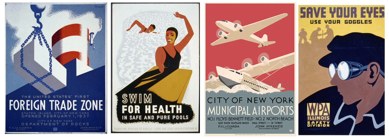 |
| Inspirational WPA posters |
6. Catnip

This one had a short deadline, as they needed it on shelves April 20th. For me, 4/20 is my daughter's birthday. But apparently, it has a different significance to a certain segment of society. Jamie wanted stoner cats. I opted for the three-eyed variety, like the one on their logo, posing them around like a George Booth comic. The original intent was to use fluorescent inks and make a black light label, like those posters that were so popular in the '70's. The print shop couldn't pull it off, but it's still came out pretty trippy.
 |
| Catnip inspiration - George Booth meets black light poster. |
7. Roller Derby Catastrophe

Another one of my favorites, it was nearly a catastrophe. Forgotten Boardwalk teamed with the Philly Roller Derby league to create a beer for Gay Pride month. Jamie wanted the label to feature a character named Murder Mittens, with rainbows somehow incorporated.

In emulating a comic book style with the line work and color, I added a little gag where the foreground character is punched so hard, her color offsets.
About the tattoos: On Murder Mitten's right shoulder, you can see a heart with 'Jamie' written across it. The kidney tattoo beside it is a nod to Seth, who donated one of his own kidneys to his mother years ago. Other tats feature bartenders Marysia, Kai, and Ryan.
I worked a rainbow into the background as a comic book style, zip-a-tone graphic. During the months between completing this design and having it on the market, you may recall a national drama surrounding Bud Lite. Certain guys felt their manhood threatened by Bud's advertisement aimed at the gay community. Was their favorite beer shitty and gay?
Quick! Shoot the beer! Attack it with your phallic weapon! Compensate, durn-ya!
On the high heels of this idiocy, Roller Derby Catastrophe hit the market and sold out before pride month was over, mainly because it was a damned good beer. Something to be proud about!
8. The Cops Finally Busted Madame Marie

This is my favorite.
Madame Marie Castello was a real fortune teller who had a little shop on the Asbury Park boardwalk. In 1973, Bruce Springsteen immortalized her in his song "4th of July, Asbury Park":
D'ya hear the cops finally busted Madame Marie, For telling fortunes better than they do...
Madame Marie died in 2008, but the shop remains, run by her granddaughter.
The Forgotten Boardwalk folks are HUGE Springsteen fans. His music plays on a loop in their restrooms. Seriously. I'm a Springsteen fan myself, it's a New Jersey law.
I wanted to depict the moment of Madame Marie's bust from the view of someone looking through the shop; beaded curtain, cops looming in the shadows. I just happened to see a photo on Instagram of funky beads from the 1970's "Sonny & Cher Comedy Hour". Alison Martino of Vintage Los Angeles had posted it (thanks!). Their colors became the springboard for the rest of the piece.
I sketched out various looks for Madame Marie before stumbling onto one resembling my friend Ayelet. She's an All-Star in my League of Awesome Friends. Portraying her portraying Madame Marie was kismet. She now has the unusual honor of seeing herself in the beer aisle at Shop Rite.
 |
| Sonny & Cher's beads, and Madame Ayelet with random pink poodle. |
9. The Brass Bandits

In another Asbury Park homage, The Brass Bandits are based on The Ocean Avenue Stompers, a brass band that does impromptu performances on the boardwalk. Taking inspiration from Jim Flora's album covers from the 1950's, I stylized them as a multi-headed unit. Getting the band to read with minimal line and palette took a bit of of tinkering, reminding me of Bill Moore's design projects at CalArts in the '80's. I don't know how much Bill would have liked this, but it was sure popular with the public. Ironically, it took the least amount of time to complete of any of the label designs. Less is more!
 |
| Some Jim Flora inspirational art. |
10. Wednesday is from Westfield

This is another favorite.
The late cartoonist Charles Addams was a New Jersey native, growing up in the town of Westfield. When he created his Addams Family cartoons, he based their house on his childhood home. As opposed to The Brass Bandits, this label was a meticulous effort. I referenced a lot of Addams' work, trying to emulate his line and ink washes - a fun challenge and chance to experiment.
Wednesday is a caricature of Jamie. The tombstones bear the names of Forgotten Boardwalk bartenders, and poor dead Seth gets served in his grave. Deep in the back you can see the Jersey devil at his mother's grave. Then there's a figure looking out from the house - is that you, Norman?
 |
| Addams Family reference cartoon, Jamie Queli aka Wednesday, and Addams' Westfield home in NJ. |
11. The Juggler

Nothing about this one came easily, and the result is an overworked mess. I struggled at the get go with the concept. I knew I wanted a sideshow set up, but was unsure how to villainize the juggler until Seth suggested "Fear.". So I made the juggler a psycho killer with a show biz bug. The victims, clockwise from ten o'clock, are Seth, Jamie, Kai, and Ryan. I didn't have the heart to decapitate dear Marysia, especially now that I can spell her name. The Strong Woman, Madame Marie, the Illusionist, and the Tightrope Walker all make return appearances on the side show posters.
My biggest struggle was with color. I can easily get carried away at the color buffet and end up with Pantone diarrhea (it printed even worse). I SHOULD have gone with a sepia tone look, like those old boardwalk photos from the 1920's. The only color would be blood red. Simple! Like this....

In Bizarro World, I got it right.
12. The Honeycomb Ride

The original concept was a tribute to the inventor of funhouse cars in the early 1900's. I didn't get far when Jamie changed gears, wanting a can that looked like a bee. So I started with black and yellow bee stripes. Once I landed on Hershey bar colors for the logo and text, the black stripes were too harsh. I toned them back to a honey yellow.
The concept of a honey dipped chocolate stout reminded me of a Reese's commercial from 1970, where a man eating peanut butter slams into another man eating chocolate and EUREKA! They discover the Peanut Butter Cup. My version has bears inspired by Marc Davis' illustrations for the Country Bear Jamboree at DisneyWorld. I miss those bears.
Reese's Cup commercial, 1970
It was so creatively satisfying creating these labels. There was no corporate look to adhere to, no gauntlet of executives. The only real limitation was to make it read on a cylindrical can. I tried to make designs that read left to right, so as you turned the can, a story unfolded.
Forgotten Boardwalk is such a whimsical place, with their funhouse mirrors and skiball games in the tasting room. Jamie and Seth have hosted so many quirky events throughout the years. It isn't just a micro-brewery, it's a happening. Or it was. Last week they announced their closure at the end of February. In a diabolical move, their landlord leased their space to another company, forcing them to shut down after nearly ten years. They were an oasis of cool in Cherry Hill, a town famous for being a Turnpike exit.
To the Forgotten Boardwalk gang I say, thanks youse guys, for letting me be a part of your awesome legacy. And to Jamie, as Bruce Springsteen wisely said, "Sha la, la, la, la, baby!"
-Steve
Fantastic article! If anyone is interested in hearing some of these stories, we had the pleasure of interviewing Steve Moore and Jamie Queli about the project. You can check it out here:
ReplyDeletehttps://podcasters.spotify.com/pod/show/pops-on-hops-podcast/episodes/Bonus-Moore-Forgotten-Labels-Steve-Moore-and-Forgotten-Boardwalk-Brewing-Company-e2c1lso/a-aakcrin
Great article! We had a great chat with Steve Moore and Jamie Queli about this project. You can give it a listen at:
ReplyDeletehttps://podcasters.spotify.com/pod/show/pops-on-hops-podcast/episodes/Bonus-Moore-Forgotten-Labels-Steve-Moore-and-Forgotten-Boardwalk-Brewing-Company-e2c1lso/a-aakcrin